Recent searches
Search options

Administered by:

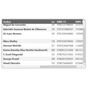
This is a nice approach to #responsive #tables in #HTML from the BBC
https://www.bbc.co.uk/sport/football/scottish-championship/table
At wider screen sizes, you see the whole thing. Narrower screen sizes have a 'freeze columns' Excel-type effect.
I haven't tested it with ATs myself, I assume they have ;)

Perhaps that is an unwarranted prejudice. The BBC are generally pretty good with their #a11y practice though.
Any thoughts from @yatil, @SteveFaulkner, @siblingpastry. @tink, @joelanman or anyone else?
I'm thinking in a design critique kind of a way. Keep it constructive and positive.
My first thought would be:
This works wee visually on mobile portrait orientation. But the table could do with a caption.

@se_davidobrien My burnout would appreciate no additional work assignments after midnight. 
Fair enough @yatil
@se_davidobrien the BBC #accessibility people are good at what they do. Aside from that, a quick check with a screen reader suggests the table works well at large and small screen sizes. Beyond that, I can't offer an opinion.

@tink @se_davidobrien @yatil @SteveFaulkner @siblingpastry a really lovely detail here is that at small screen sizes, the team names become hand written shorter versions (Wolverhampton Wanderers > Wolves). That helps overcome a problem with this pattern where frozen columns take up too much screen space

@joelanman @tink @se_davidobrien @yatil @SteveFaulkner Looks good to me, really simple too, seems like all they're doing is using position:sticky on the row headers, hooked by horizontal scrolling. Probably a bit more complex than that, but that's the basic approach, which has no impact on the acc tree as far as I can tell. It's slick, I'm impressed.
@joelanman Oh! That's excellent! I'm not a football fan so wasn't really paying attention to the content, but that's a really nice touch 
@tink @se_davidobrien @yatil @SteveFaulkner @siblingpastry my main concern with any sticky elements is at high zoom levels they can obscure other content
@joelanman @tink @se_davidobrien @yatil @SteveFaulkner Yeah they can, sticky positioning has to be used carefully. It's not a problem in this case, because the only content they can overlap is designed to handle that. It does suffer a little bit from lack of space at 400% zoom, but it remains readable (row header + 3 data columns remain visible in one view)
Thanks all. Some really good insights.
I hadn't noticed that, it's a nice touch.
Seeing also now how background-color and border-right also change on window resize events.
It's very nicely done.

@se_davidobrien FWIW, I have written extensively on this pattern over the last few years and many other orgs now use it. The BBC approach is (thankfully) common.
You can see links to old browser bugs, demos, and comments in my 2020 post: https://adrianroselli.com/2020/01/fixed-table-headers.html